
How to Brand All of Your Offerings As Siblings In Your Brand Family Tree
This guest blog post was written by our friends at MKW Creative Co.
Seldom do we see someone like yourself who only ever does one thing, am I right ladies? Not only is it now the norm, but as a culture, millennials in particular are champions of the multi-passionate entrepreneur-trope. Sound familiar?
I know you, because this is also me. Hustling, binging podcasts, learning how to monetize a social following, launching a podcast, being on the verge of starting a course then bailing… offering a laundry list of services and offerings to best serve your ideal client or customer, and then throw COVID in the mix?! Turns out your virtual and online services now want just as much of your attention as the ones you were offering pre-panorama.
My name is Michelle Wintersteen and I am the founder, designer, and creative director behind MKW Creative Co. Our mission is to build brag-worthy brands for social media minded entrepreneurs through visual strategy, compelling and high-converting design and marketing. In the last 7 years, I’ve worked with over 300 brands, developing visual identities that embody each entrepreneur’s mission, vision and goals and have noticed a consistent trend among today’s entrepreneurs…
Deciding how to co-mingle all of your offerings leaves their brains feeling more like a scrambled bowl of spaghetti noodles than a streamlined CEO/COO/CFO. Even worse? They fear their ideal clients, collaborators and best brand ambassadors got totally lost in the scrambled spaghetti bowl shuffle of multiple offerings.
The solution is a solid brand architecture.
Brand Architecture refers to the organization of an organization. Confusing, but stick with me. Think back to your corporate job, university board, or even your sorority. Recall the old composites that hung in the house, or the HR packet with the spider web-like structure org chart that mapped out who reported to whom. This is what you’ll want to do with your brand.
On a blank sheet of paper, (or the notes app of your iPhone) put yourself at the apex. You’re the expert, the rainmaker, the entrepreneur; all of your efforts and interests are naturally an extension of you.
From here, branch out into each of your offerings: services, products, affiliate opportunities, marketing channels, passive income, etc. Keep related products and services in close proximity and create bridges between consistent themes, ideas, price points, and ideal clients. Check out the IGTV where I explained this for myself here.
Now that you’ve got everything out on the table, how do you begin to organize all of this for your audience without sounding certifiably insane? This is where Branding comes into play. In this article, I’m outlining 3 of my brand design & positioning best practices for creating a cohesive Brand Family, where your offerings look like siblings, not twins… and also not like distant cousins twice removed.
There are three distinct ways we can approach your multi-faceted business and social media presence so your audience says “eff yes” and not “wtf is going on here”. Specifically those strategies are Color Coordination, Naming Conventions, and Sibling Seniority.
Color Coordination
More than 70% of the information we process on a daily basis is visual. Having a strong visual identity helps to cement all of your brand’s offerings in your ideal client’s memory, turning into a better non-verbal understanding of how their related to one another (everything else is the same, yet the color palette shifts slightly from offering to offering).
FOR EXAMPLE…
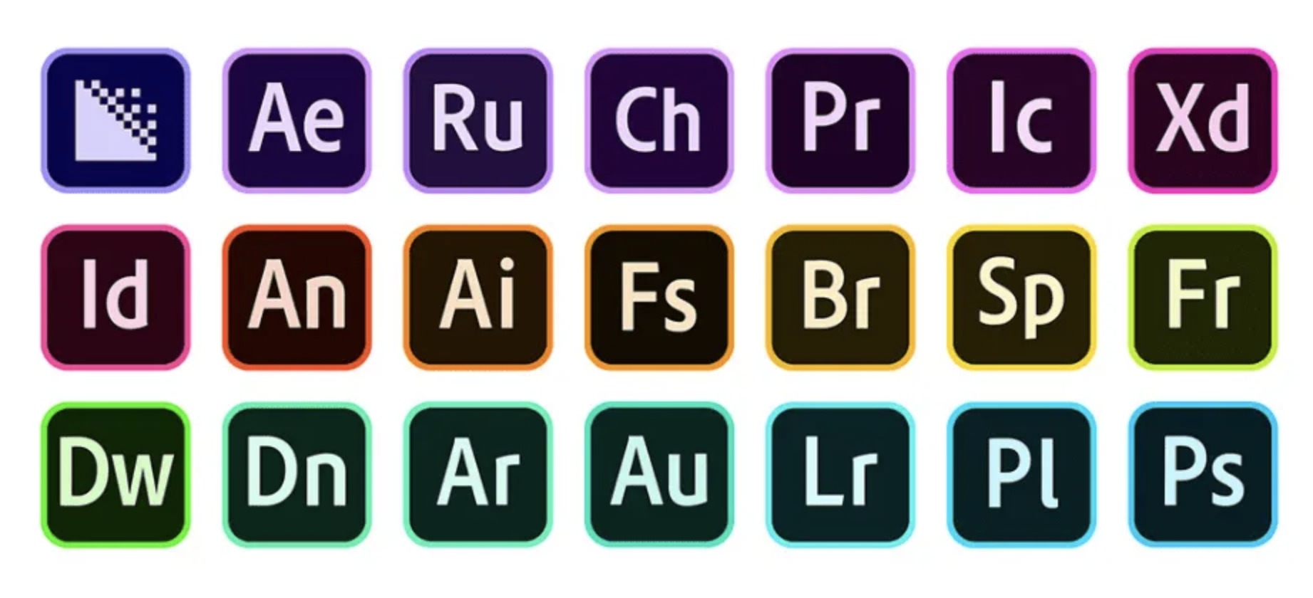
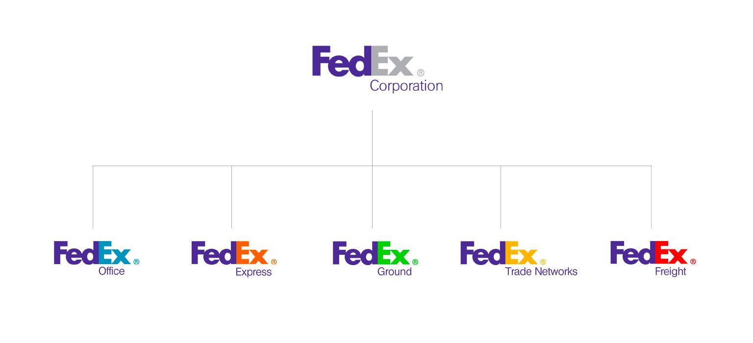
FedEx and Adobe employ this technique to signify their different branches or software programs. The color coding of different branches isn’t new… in fact you probably have been doing this since middle school when you picked a red binder for reading and a green one for science. Same idea, but now apply it to your business offerings. Can your services be color coded differently than your consulting? Can your product shop or affiliate partnerships use a specific color to stand out on your feed or in your Youtube Thumbnails? Not only will this help you keep your organizational sanity, it will make for a great customer experience.
Naming Conventions
Naming Conventions are a great way to separate out your products & services in a creative, very on-brand kind of way. Creating a consistent naming convention for your offerings gives you a framework for what you’ve currently got cooking, and a roadmap for future endeavors.
FOR EXAMPLE…
This is a strategy I employ in my own business. When I started MKW Creative Co (formerly MKW Graphics) I knew I wanted to also host a community, but didn’t want to call it the “MKW Creative Co Community” because c’mon that sounds horrible. Instead, I hinted at the brand with a nod to the “K” and the same kind of bold, sassy energy that my brand design style exhibits. Thus, Kiss My Aesthetic Facebook Community was born.
I took this idea and ran with it when I started hosting online workshops, design challenges, and trainings at the start of COVID. Instead of Kiss My Aesthetic, I developed:
Kiss My Loops: TikTok Training
Kiss My Insta: Instagram Training
Kiss My Canva Reels Training
Kiss My Portfolio Design Challenges - for designers to design better
The Kiss My Aesthetic Podcast - Join the 10k+ Downloads!
Another business that uses a consistent naming convention is Savvy Interiors. The San Diego-based top Interior Design and remodel firm has a design showroom and facebook community called inSIDE by Savvy, a nonprofit organization doing room makeovers for children facing medical crises called Savvy Giving by Design, and a buy/sell community called Savvy Steals and Deals. All of these offerings branch from the “Savvy Universe” but take on their own names, characteristics, and variations of branding.
Sibling Seniority
The last strategy for creating a Brand Architecture in your family of Brands is to create your offerings as members of the same family in visual aesthetics. What I mean is this… If you have 2+ branches of your brand family tree, which one is the oldest, most mature, professional, buttoned up, and regimented? Conversely, which is the most free-flowing, exciting, bold, turnkey and magnetic? Can you employ branding techniques that emphasize those qualities? You betchya bottom dollar you can.
FOR EXAMPLE…
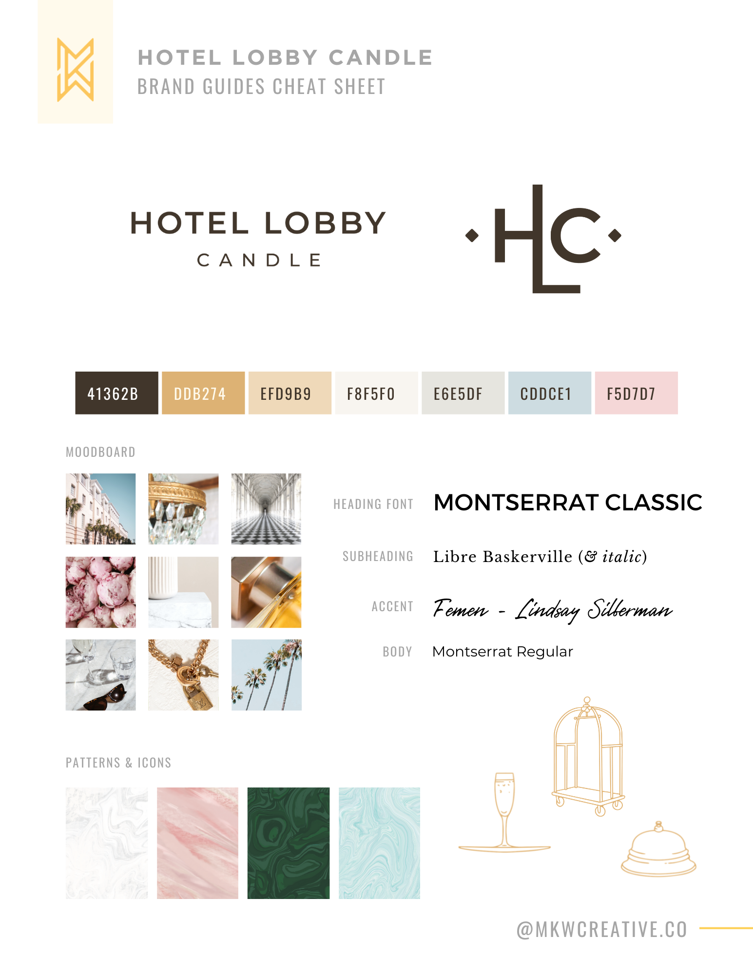
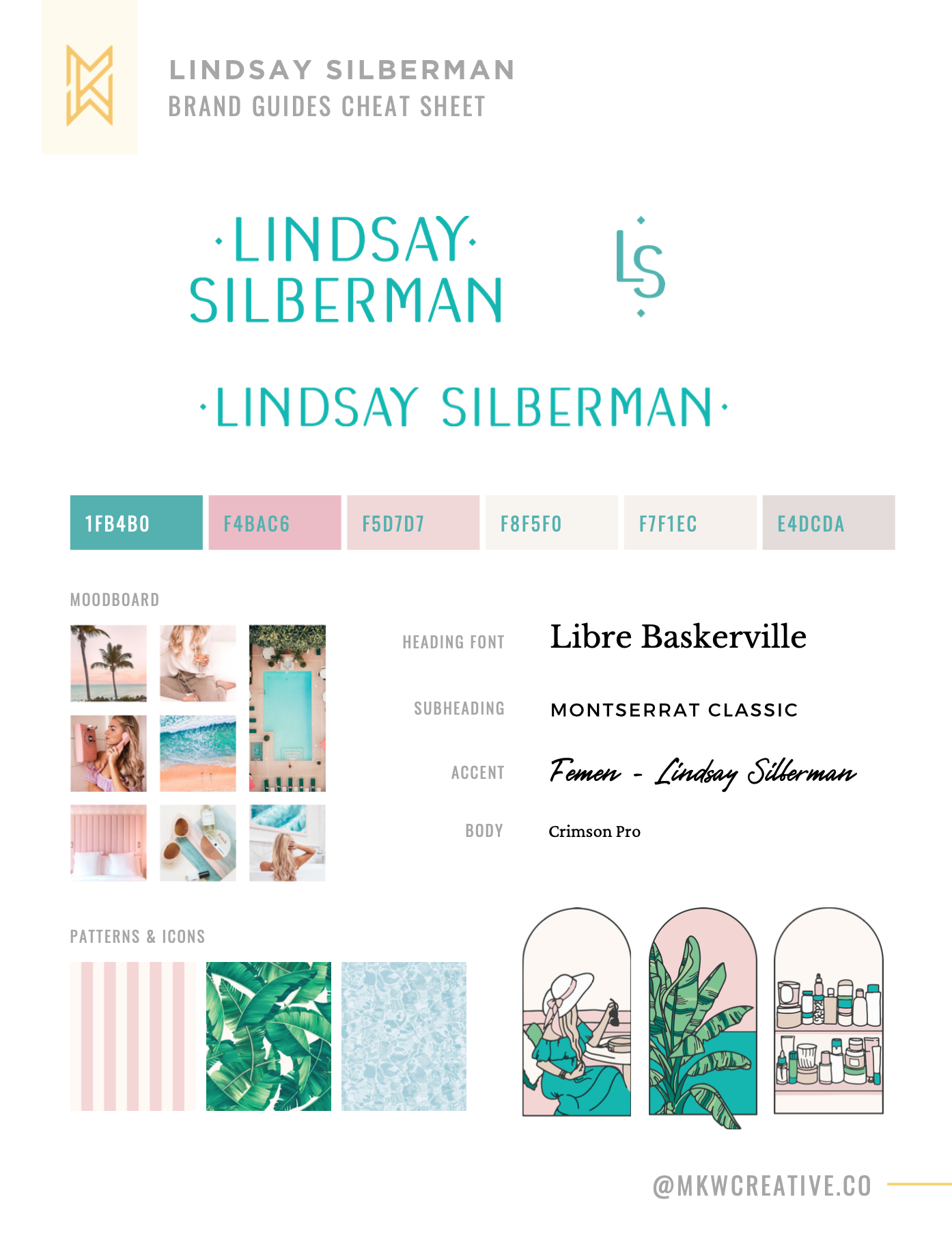
When designing the brand for Lindsay Silberman’s blog and social, we leaned into her own personal aesthetic with pink, palms, teal and feminine fabulousness. See her brand design presentation video here.
However, when Lindsay hired us to do the branding for Hotel Lobby Candle our strategy was to make HLC the more mature, bougie older sister of the Lindsay Silberman brand. Here’s how we achieved that:
Bright Teals and Hot Pinks became more subtle and muted
We brought in more neutrals and metallics to balance the feminine colors
We leaned on expensive feeling textures like marbles and stone
Our imagery become more editorial and refined, less documentary
… and our fonts stayed EXACTLY the same, we just swapped the H1 & H2
The end result is two brands that can run in parallel to one another without looking like a carbon copy. By giving these two sister brands similar, yet distinct visual identities, we keep the audiences engaged in both camps, and the offering visually organized for Lindsay and Team HLC.
In Conclusion...
Your business is your baby. Your baby wants siblings. It’s siblings deserve to be special, unique, and embraced for their unique purpose. Although everything branches back to you, your service offerings, products, collaborations, heck even your entrepreneurial lifestyle can be branded in ways that give each branch it’s own identity. By visually organizing their differences through color, naming conventions or seniority, you’ll save yourself and your audience from oversaturation of one “look” that’s trying to say so much all at once.
Still looking for help? Drop me a note here and I can send over a link for a free 15-Minute Brand Discovery Call. Join me on the ‘Gram, TikTok, Facebook, Pinterest and just about everywhere else at @mkwcreative.co.