
How We’re Boosting Brand Recognition Through Visual Consistency
Keeping your brand's look and feel consistent across all platforms is crucial to boosting brand recognition in the digital space. Visual consistency revolves around the cohesive use of fonts, colors, visuals, and logos across your website, packaging, social media, advertisements, and more.
It's not just about having a fancy logo or trendy colors; it's about creating a vibe that's uniquely yours and sticking to it across every platform. In today's crowded digital landscape, standing out is crucial. When your audience sees your consistent imagery and voice across social media, they know it's you without even having to look at your profile picture. And that's where the magic happens – building brand recognition.
See, in today's crowded digital space, standing out is everything. But here's the kicker: it's not just about getting noticed; it's about building trust and loyalty. When your audience knows they can count on you for consistent and quality content, they'll keep coming back for more. Once trust and loyalty are established, users will be more likely to take action, whether it's making a purchase, signing up for your email list, or sharing your content.
Navigating visual consistency across different social media platforms can feel like a daunting task, especially when going from a “perfect” platform like Instagram to a more casual and relatable one like TikTok. Fear not! With a few strategic tweaks, you can maintain a cohesive brand aesthetic while adapting to each platform's unique vibe.
INCORPORATE BRANDED ELEMENTS
Consistency matters! Keeping your color palette, typography, and imagery consistent across platforms isn't just about looking good – it's about being memorable. When your brand has a consistent vibe, it's like having your own signature style. People recognize it, connect with it, and trust it.
When designing, it is important to keep these five design elements in mind:
Visual hierarchy - organize elements to convey importance and guide the viewer's eye through the design. Think of this as visual storytelling!
Alignment - strategically place text, graphics, and other elements in a way that creates harmony and structure
Colors - keep your brand palette simple and recognizable by sticking to 3-5 colors that go well together
Fonts & Typography - stick to two fonts that match your brand's identity: one main font and one complimentary
Dynamics & Effects - use contrast to highlight key ideas, whether that be through bolded fonts, eye-catching colors, or supporting elements
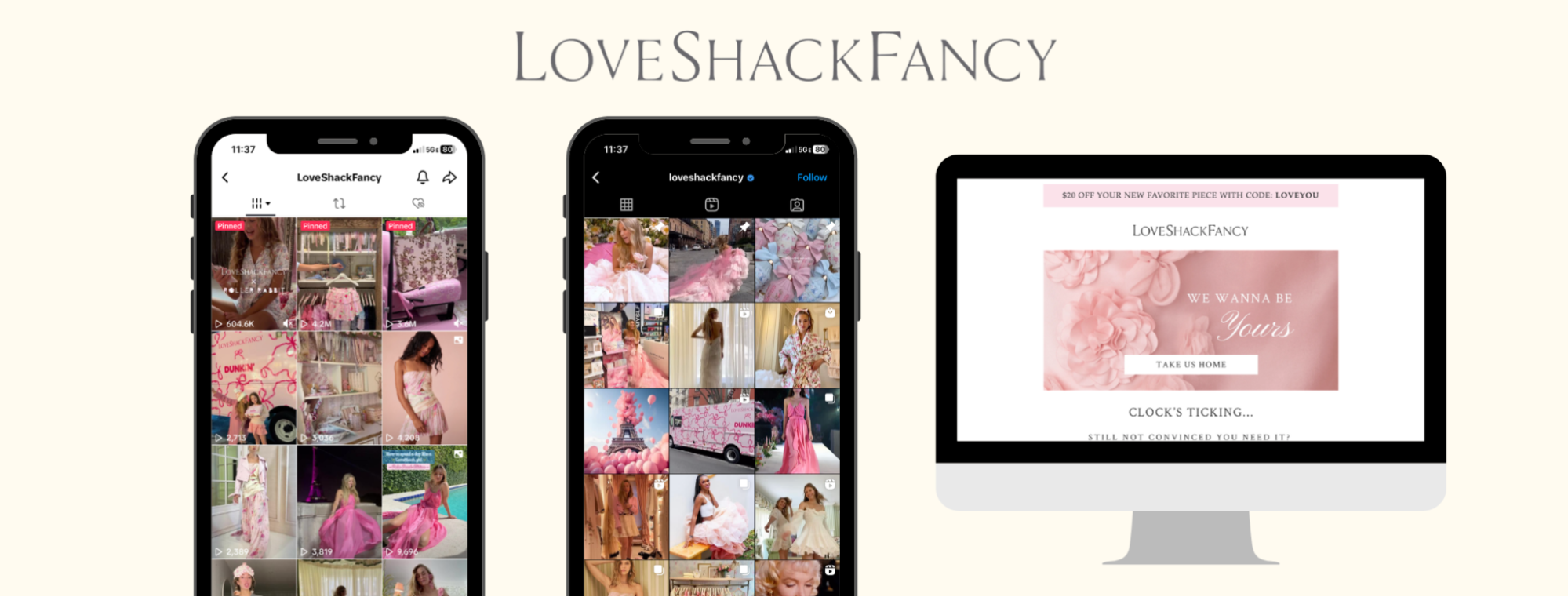
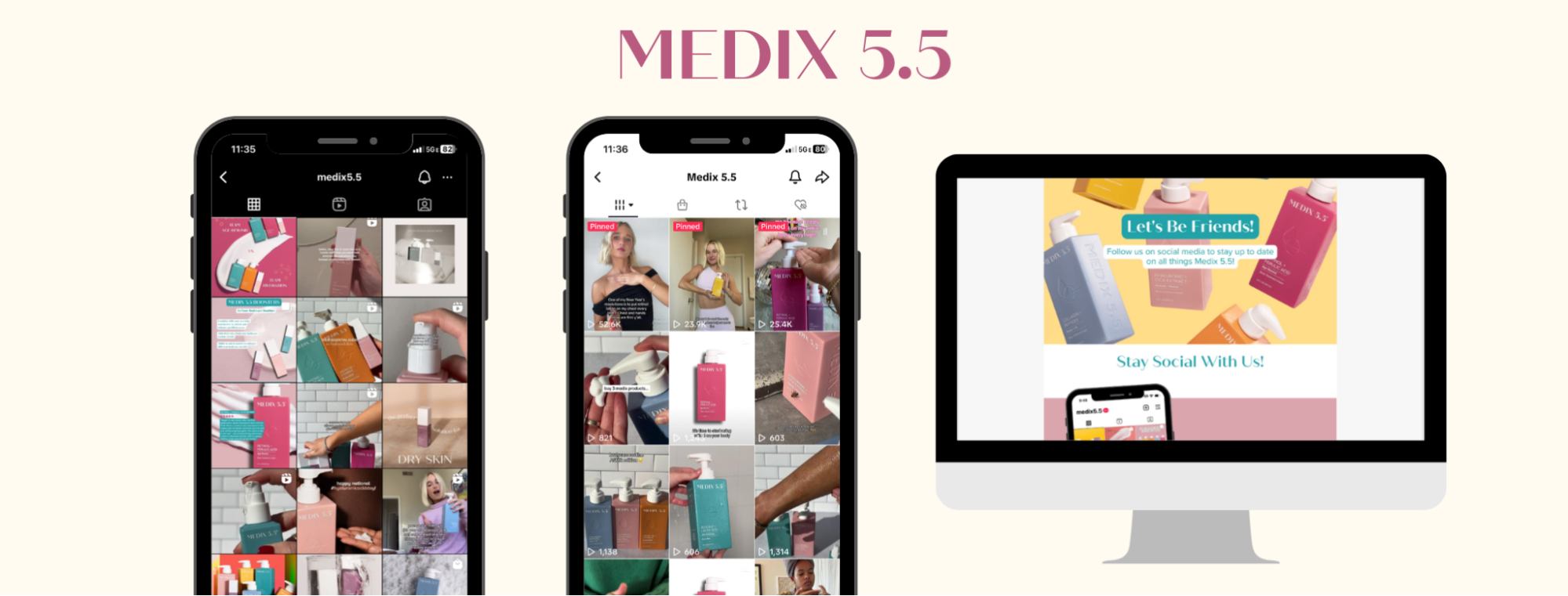
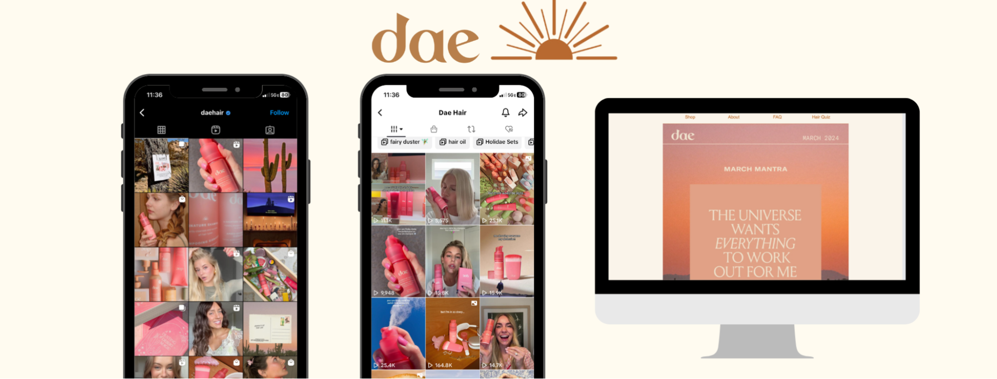
Ensuring these elements stay consistent isn't just about aesthetics – it's about making a lasting impression. Here’s an example of a few brands that strategically used these five elements to create a unified presence across all of their marketing channels.
CREATE ADAPTABLE TEMPLATES
Utilize your established brand palette to create cohesive templates that you can easily resize and tweak as needed across platforms. Whether you're designing for Instagram, Pinterest, TikTok, or any other platform, it's all about saving time and ensuring consistency without sacrificing creativity. Using tools like Canva, you can design templates that are not only visually appealing but also easy to edit, update, and resize to any platform.
Work smarter, not harder by extending the lifespan of your content. You don't need to start from square one every time you need to create a new post. Adaptable templates allow you to repurpose and reuse a single piece of content across various platforms over an extended period.
Here’s an example of how we’ve adapted what was once a blog post into an engaging graphic that’s been tweaked and re-purposed on various platforms to engage and inform our audience. The creation of ONE blog post allowed us to create an informative IG carousel, a LinkedIn post featuring an informative PDF, and an engaging newsletter.
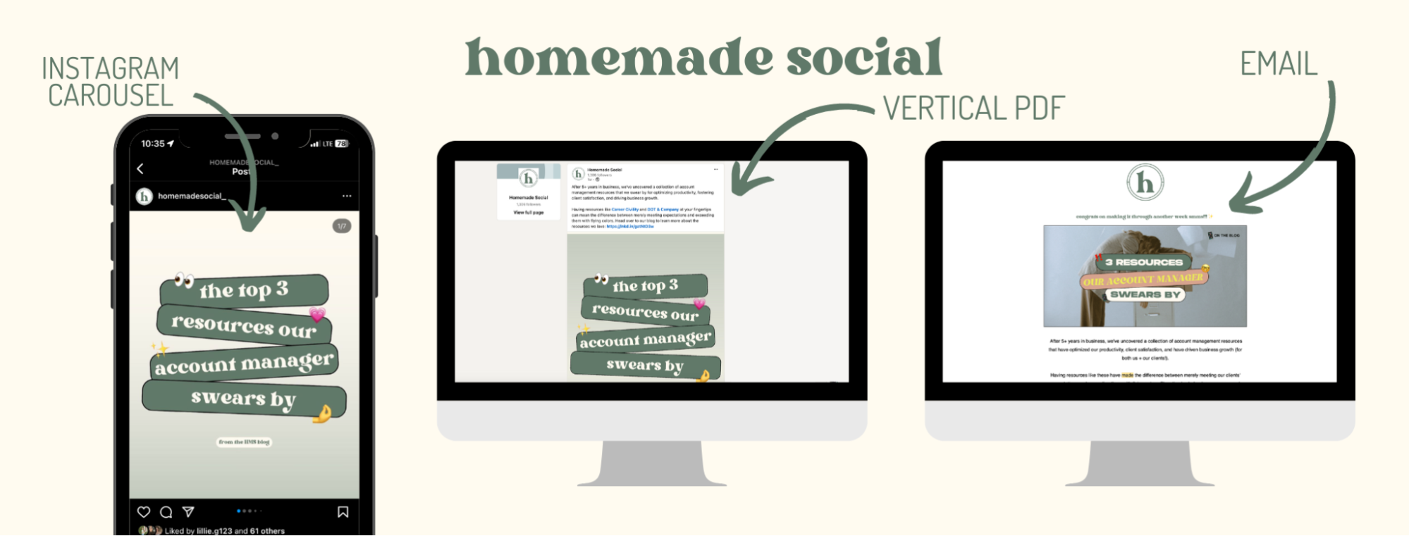
Once the original graphic template was created, all we needed to do was make small changes that catered to each individual platform’s best practices and sizing requirements. This ensures brand coherence across platforms and maximizes the longevity of content overall.
UTILIZE SMM PLATFORM FEATURES CREATIVELY
Once your brand elements and templates are established, make use of each platform's unique features to infuse your brand's personality, while adhering to platform-specific trends.
Let's break it down: imagine you're launching a new product on Instagram and TikTok. You’ll want to have a cohesive and unified launch campaign across platforms, while also uniquely tailoring each piece of content to the specific platform.
On Instagram Stories, use interactive features like polls to engage and gather feedback. On TikTok, integrate trending sounds for entertaining content. Despite platform differences, maintain your brand's aesthetic with consistent colors, fonts, and imagery. A lot of this can start with your photography and videography content. Having consistent imagery to share across platforms that is representative of your brand ensures your audience easily recognizes and connects with you, no matter where they find you.
Visual consistency isn't just about looking good; it's about owning your brand's vibe across platforms, being memorable, and building trust. So, keep it real, keep it consistent, and watch your brand shine online. If you're ready to take your Instagram game to the next level, check out our online course, Own Your Instagram. It's your complete guide to managing Instagram with ease and cultivating an audience that's not just engaged, but ready to buy from you!
For more tips, follow us on Instagram and subscribe to our weekly digital marketing newsletter. Chat soon!
xx,
The Homies