
5 Elements to Consider When Designing Graphics for Social Media
We get it. Graphic design can be overwhelming. So many elements, colors, texts, photos, things to include in just one graphic. Where to start? Where to end? Read on for the 5 most important elements to consider when designing graphics for social media.
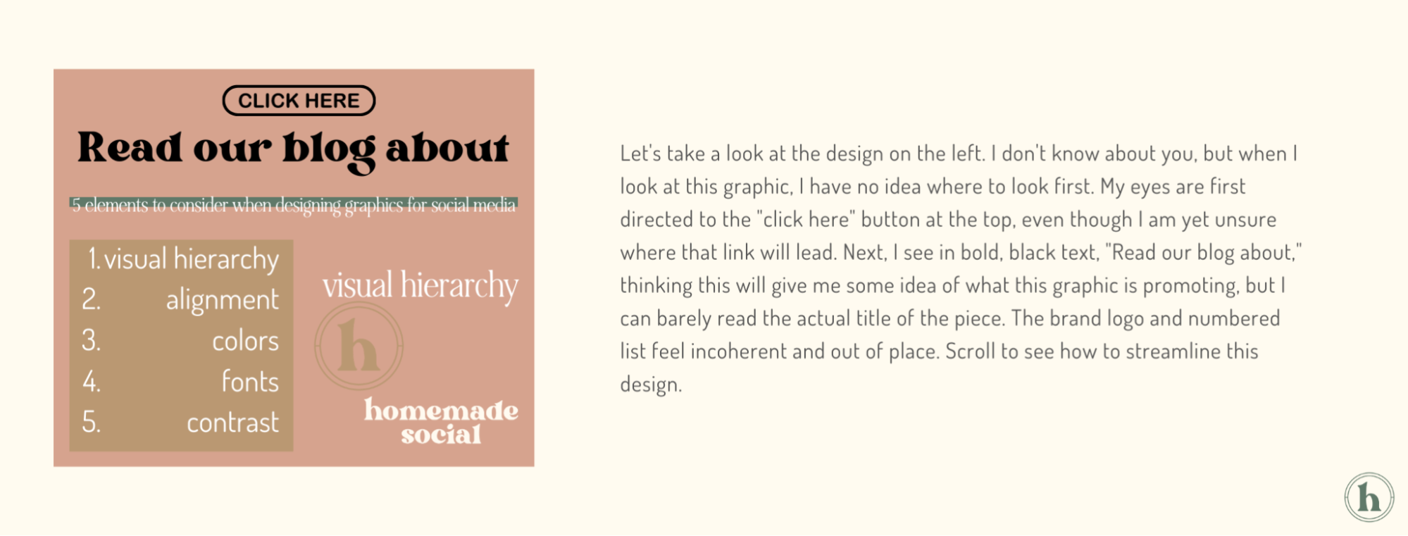
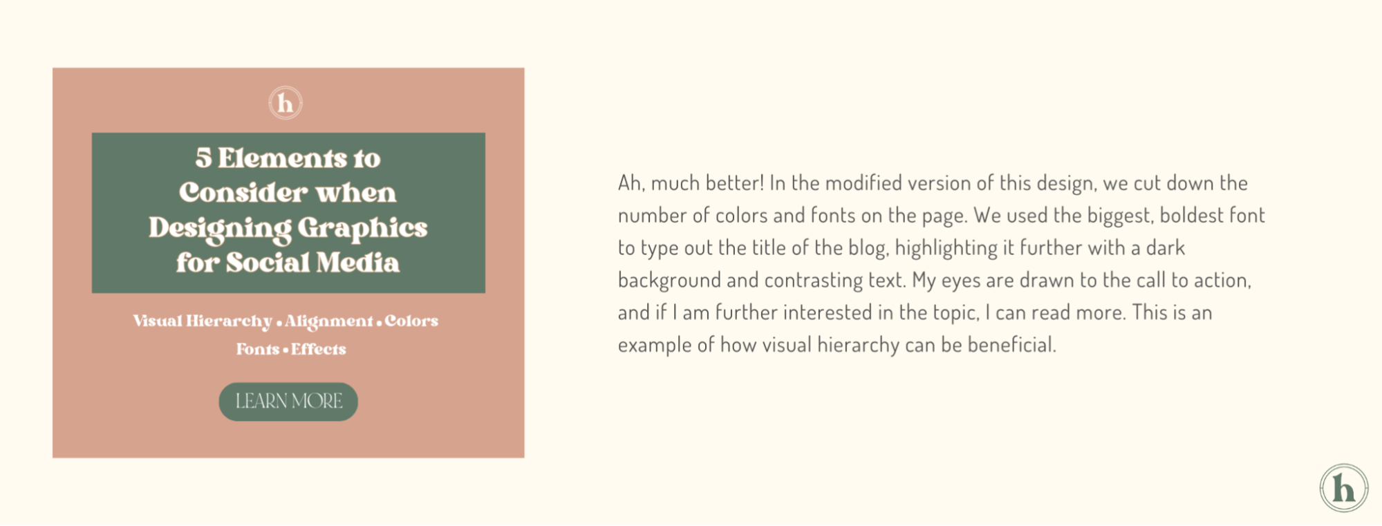
VISUAL HIERARCHY
The number one tip to mastering graphic design is visual hierarchy. Visual hierarchy involves organizing elements in a way that communicates their order of importance. Because the eye is naturally drawn to certain visuals more than others, it is important to arrange your graphic strategically.
Think of this as a form of visual storytelling in which we want everything to flow. Start by asking yourself: what do I want to convey through this design? Is it the name of your company? The fact that you are having a sale? What is your goal?
Whatever it is, make sure all elements of the design point to this. Make the part of the photo you want to emphasize the most obvious part of the design. Think of visual hierarchy as an umbrella for the remaining 4 tips covered in this blog. Each of the following sections can help facilitate a successful visual hierarchy.
ALIGNMENT, SPACE, & SCALE
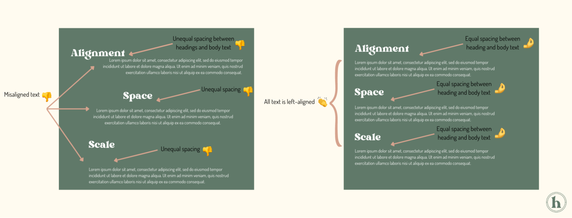
ALIGNMENT
Let’s talk alignment. This is one of the easiest ways to make your design look clean and put together, as alignment helps create structure within a design. By strategically aligning texts, graphics, and other elements, a sense of visual harmony and unity is created. Plus, the design will be more readable and visually pleasing to look at.
A good rule of thumb when it comes to alignment is to stick to one side. Make all of your text right, left, or center justified. Once you feel more comfortable, you can play around with juxtaposition, which is placing elements side by side to create a contrasting effect!
*Tip: Most design software will notify you if your elements are aligned; pay attention to the pink lines or where your graphics naturally "snap" to!
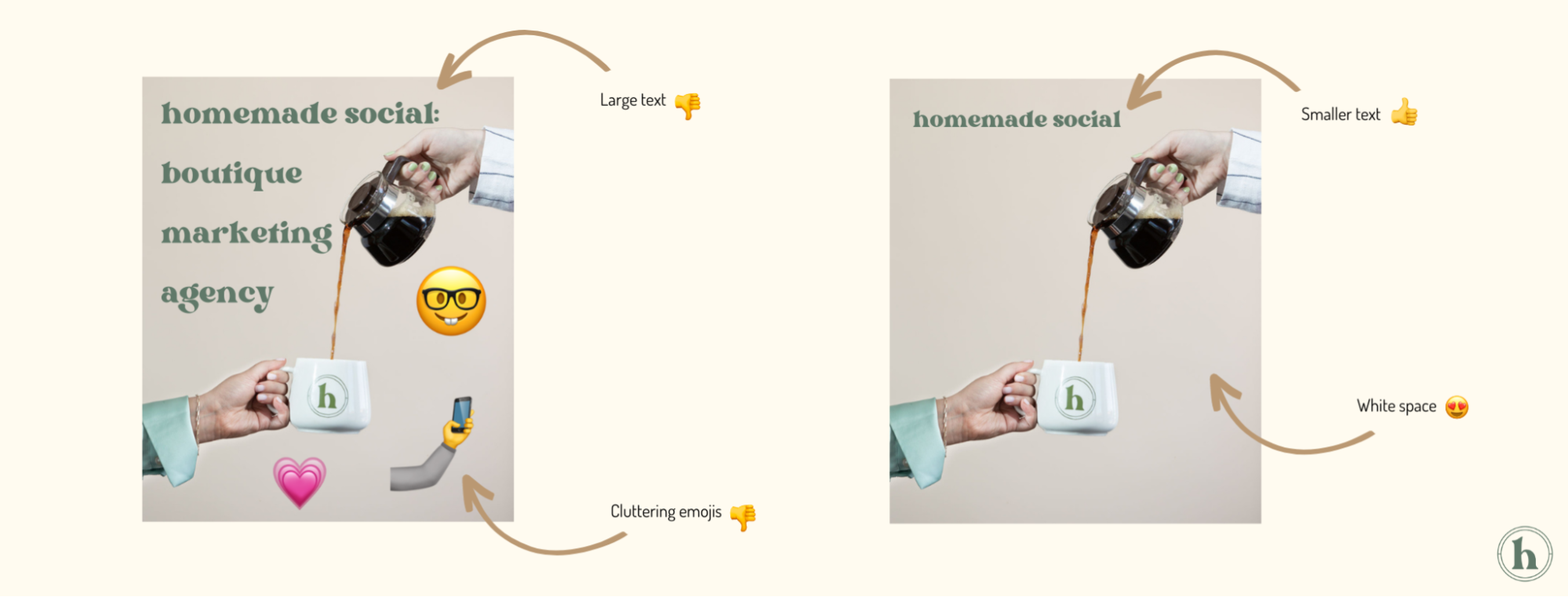
SPACE
Ever heard of information overload? Oftentimes, people are eager to add more to their designs. More color, more text, more graphics, etcetera. In doing so, the importance of space can be forgotten. Too many elements packed into one design can make it difficult for the brain to filter through what it is looking at and pick out what’s really important. Additionally, employing white space, or any area of the page with no content, helps make the important parts of your design pop. So utilize space to your advantage and let your design breathe!
*Note: white space does not necessarily mean the color white. It can be any part of your design that is empty, regardless of the color of the backdrop.
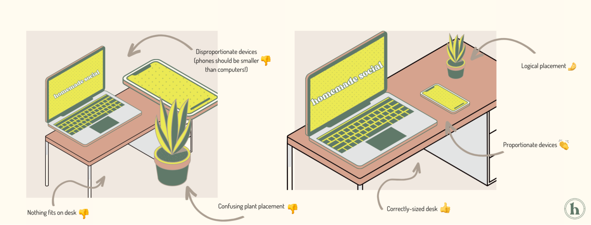
SCALE
Scale is the master of balance and proportion. It is created when comparing the sizes of two objects. We can play around with different text and graphic sizes to create a strong composition, with the goal being to create a balanced look. For instance, we don’t want all of the text to be massive, nor do we want all of the text to be minuscule. A mix of both can best achieve visual hierarchy, in which our eye is drawn to the most important part, but we can still learn more through the smaller elements.
COLORS
Another simple way to create consistency and identity through design is with color. Staying within one color group will easily make your design more appealing. Rather than being confused by a never-ending rainbow, the eye is drawn to a harmonious, easily digestible color palette. Graphic design is an essential form of visual communication, and colors can help evoke certain emotions or ideas.
Aim to use a cohesive color group of 3-5 colors that will be used throughout the design. If you are a brand, try sticking to your brand color palette to increase brand recognition.
First, set one or two primary colors. This color will be the one most strongly associated with your brand and should resonate with your target audience.
Then, select accent colors. These should complement the primary color(s) and add interest.
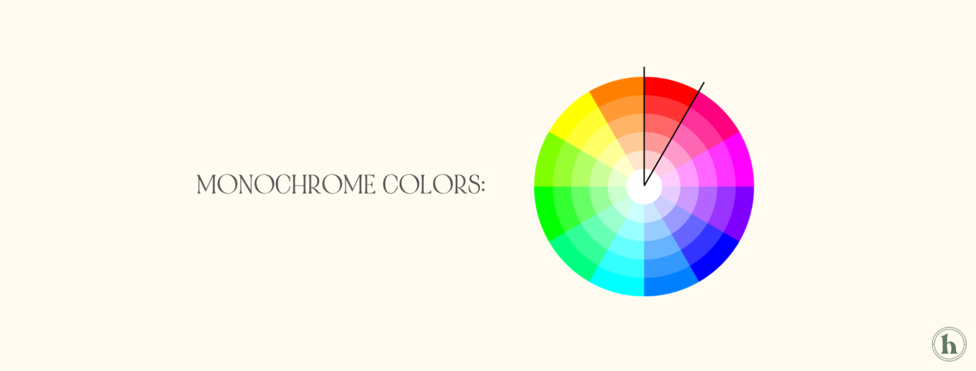
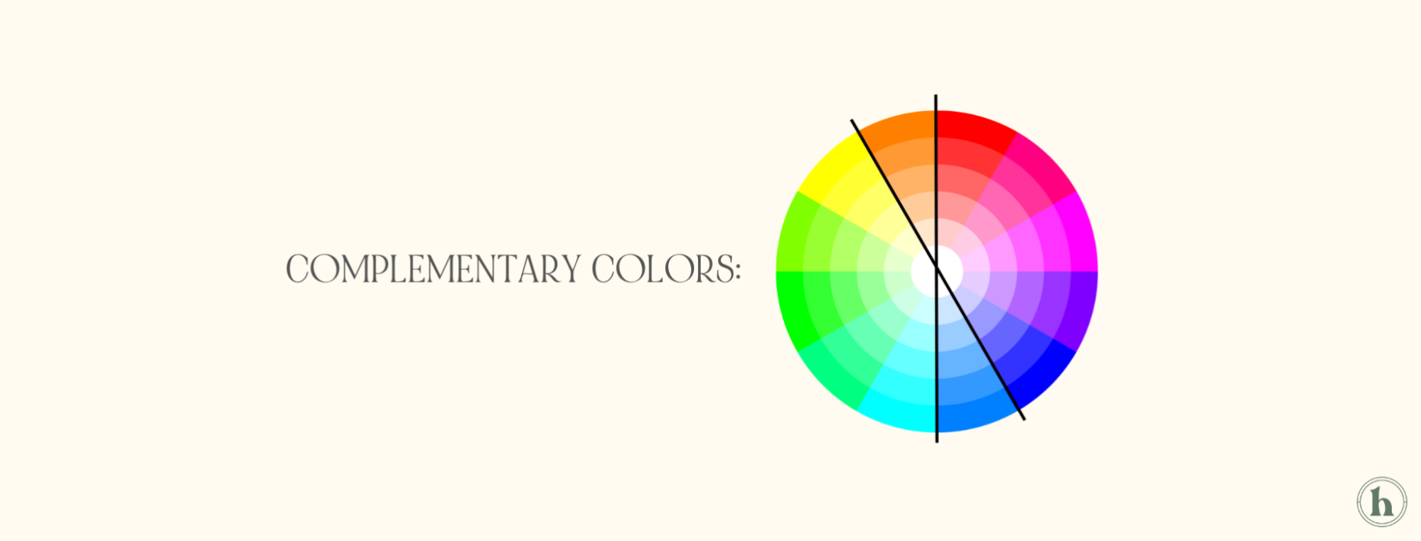
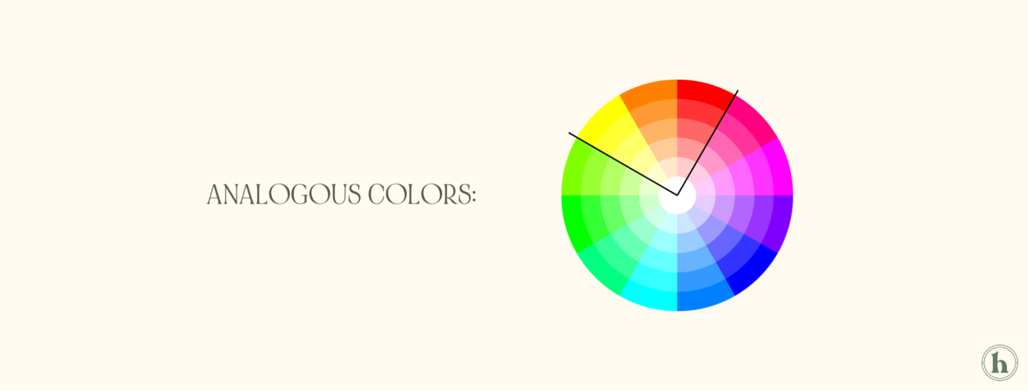
When it comes to color theory, there are three main concepts that may prove useful if you are feeling stuck:
MONOCHROME COLORS: Monochrome is a color scheme that consists of varying shades and tones of one color.
COMPLEMENTARY COLORS: Complementary colors fall opposite each other on a color wheel. Red and green, orange and purple, and yellow and blue are all complementary color pairings. Although these colors seem contrasting, they bring out their complementing color in the best way.
ANALOGOUS COLORS: Analogous colors are the ones that are adjacent to each other on the color wheel. So, red-orange-yellow and green-blue-purple. Think rainbow order! These sets are great for acting as accent colors.
While it is not at all necessary to use these color schemes, color theory can be a helpful tool!
*Tip: If you use a graphic design software that allows you to make brand kits, save your chosen color palette there. That way, the colors are easily accessible when creating your designs.
FONTS & TYPOGRAPHY
Just like colors, fonts are fantastic at portraying different emotions. From script to cartoon to bold to simple, there are tons of genres of fonts. It is important to choose a font that feels conjunct with your brand’s identity. For example, a dramatic, cursive script or calligraphy font can give off an air of elegance and sophistication, whereas a sans-serif font, one without any fancy strokes, might depict simplicity. A modern, geometric font could be fitting for a technology brand, while a bold font might be best for an upscale bar. Use the plethora of font styles to your advantage and find one that works for you!
So yes: there are a million and one fonts out there. That doesn’t mean you should load as many fonts as possible onto one design. It is recommended to stick to 2 fonts:
One main typeface
One complimenting typeface
The main typeface could be the one you use to type the name of your brand, while the complimentary or accent font writes out your slogan or accompanying information. Similar to how we want to maintain a specific color palette with primary and accent colors, sticking to a couple fonts exudes cohesion and harmony.
*Tip: if you are illustrating on a graphic design software like Adobe Illustrator, use Adobe Fonts or DaFont.com to find and download fonts!

CONTRAST, DYNAMICS & EFFECTS
Last but not least, let's visit contrast, dynamics, and effects. To make sense of this, allow me to give you an analogy. If you were a musician, one of the most important elements to pay attention to is dynamics, or how loud or soft you are playing. Playing an entire piece at one volume makes it feel drab and still. However, fluctuating in volume and tone creates movement and interest. Let's translate this to graphic design.
Use contrasting colors, fonts, and elements (just like contrasting volumes in music) to make ideas more clear. For example, you may use your most eye-catching color to highlight your big idea. Then, you may use your accent colors to further describe. Similarly, you may want to make your big idea BIG. The accompanying info can be a bit smaller. See how this makes the designs more engaging?

To create movement in a design or bring it to life, consider layering and effects. Adding something as simple as a shadow, outline, or background can make the biggest difference. Consider fun backdrops, adding stickers, and interesting shapes to boost your design! To illustrate this, let’s modify the same text in several different ways.
*Tip: get creative and don't be afraid to think outside the box!

Okay, we talked about a lot. Let's take a refresher. When designing graphics for social media, consider:
Visual hierarchy. The goal is to create a balanced composition that highlights the most important information.
Alignment, space, & scale. Use space, symmetry, and size to facilitate a harmonious design.
Colors. Create a palette and stick to it!
Fonts & typefaces. Choose fonts wisely and limit your fonts to 2-3 per graphic.
Dynamics & effects. Create movement and interest through elements besides just colors and texts.
With the help of these graphic design tools and design thinking, you can streamline your designs and create beautiful, seamless graphics. Now go forth and create!
xx,
The Homies